Most Webal modules can be made narrower, centred, lined up, spaced out, run from edge to edge or hidden on small screens. You do all of this on the module's Layout tab, and you never need to write code. This page shows how, one job at a time. Every option is also listed in Options shared by many modules.
A block here means one Webal module as it shows on the page.
Where the options are
- Log in to the Joomla administrator, choose Content, then Site Modules, and open your module.
- Open the Layout tab.
- The first group is General. Below it come Spacing and, in most modules, Width.
- Change an option, press Save, and look at the page on your site.
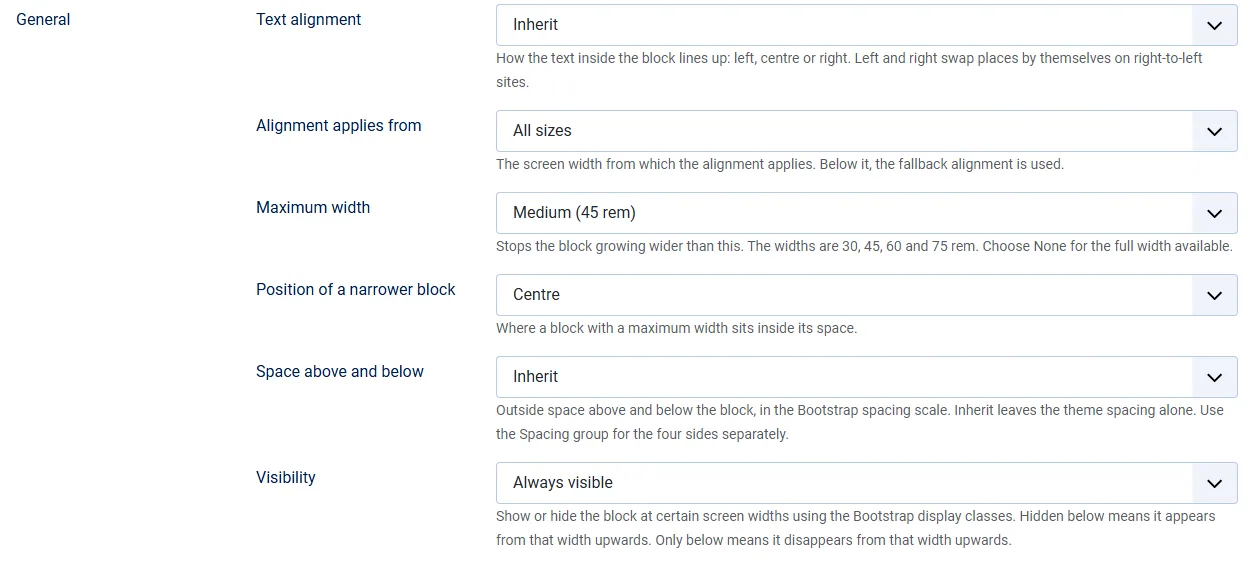
Webal Offcanvas and Webal Modal have the General and Spacing groups but no Width group. Every other Webal module has all three.
Centre a block at a narrower width
A block normally fills the width of its place. To make it narrower and put it in the middle:
- In the General group, set Maximum width to Small (30 rem), Medium (45 rem), Large (60 rem) or Extra large (75 rem).
- A new option appears below it: Position of a narrower block. Choose Centre. The other choices are Left and Right.
- Press Save.
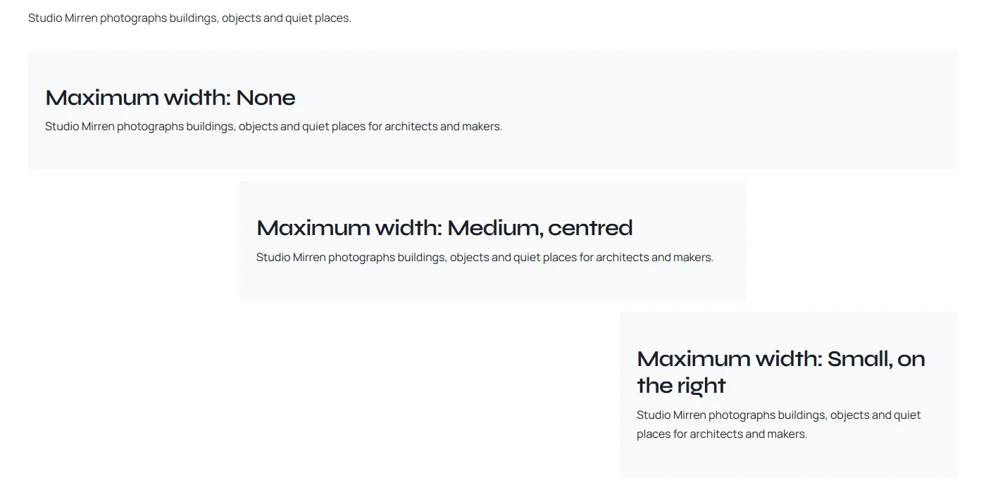
On a screen 1400 pixels wide, Small was 480 pixels wide, Medium 720, Large 960 and Extra large 1200. The maximum width is the widest the block can be. On a phone the space is already narrower than that, so the block simply fills the width.
Tip. If your template draws a frame round each module, such as a card with a thin border, the frame stays full width and only the block inside it gets narrower. To remove the frame, open the Advanced tab and set Module Style to None.
Tip. The Spacing group can override the position. If Space outside: left and right is set to a number, Position of a narrower block is ignored, and the block sits on the left with that space beside it. Choose Automatic (pushes to the centre or the edge) there instead, and the narrower block is centred.
Line up the text
- In the General group, set Text alignment to Left, Centre or Right. Inherit follows your template.
- Press Save.
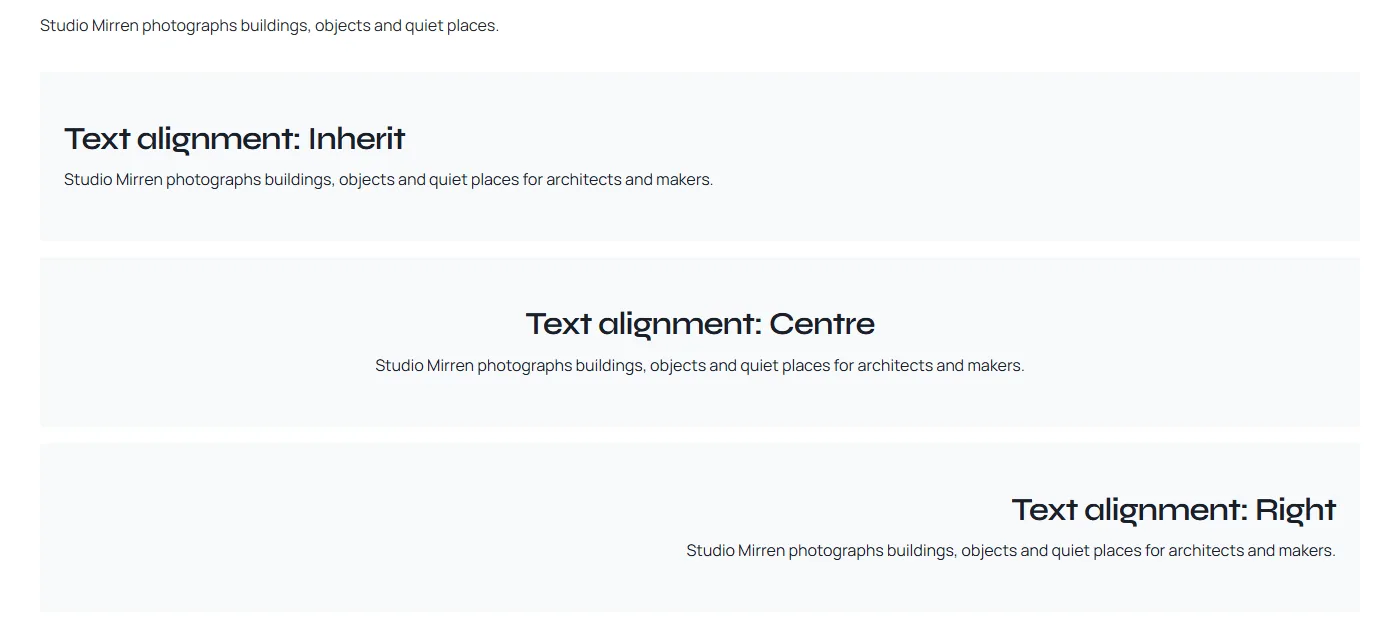
On a right-to-left site, Left and Right swap places by themselves.
Line up the text differently on phones
For example, to keep the text on the left on phones and centre it from tablets up:
- Set Text alignment to Centre.
- Set Alignment applies from to Medium and up (768 px).
- A new option appears: Alignment below that width. Choose Left.
- Press Save.
On a phone 390 pixels wide the text then started on the left, and on a wide screen it was centred.
Buttons and forms keep their own place
Text alignment lines up words. It does not move every part of every module. This table shows what Centre did in the modules that were checked.
| Module | What Centre does | What to do |
|---|---|---|
| Webal Text, Webal Heading, Webal Features | The headings and the text are centred. | Nothing more. |
| Webal Call to action | The heading and the text are centred. The buttons stay at the start of the line. | On the Look tab, in the Buttons group, set Alignment to Centre. |
| Webal Button | The buttons do not move. | On the Look tab, in the Buttons group, set Alignment to Centre. |
| Webal Form | The labels are centred. The boxes keep their width, and the Send button stays at the start of the line. | There is no option to move the button. |
| Webal Newsletter | The heading and the introduction are centred. The email box keeps its own width and stays at the start of the line. The Subscribe button stays at the start too. | There is no option to move them. Leave Text alignment on Inherit if this looks uneven. |
| Webal Contact details, list layout | The details are centred, but the icons and labels stay at the start of the line, so the list looks uneven. | Leave Text alignment on Inherit. |
In Webal Form and Webal Newsletter, each box and its label sit 1.25 rem in from the edge. That space holds the red bar that marks a mistake, so the box does not jump when the bar appears. Other modules may have parts with a place of their own too, so always look at the page after you change the alignment.
Run a band from edge to edge
- In the Width group, set Width of the block to Full width, edge to edge.
- A new option appears: Width of the content. Container (centred) keeps the words in line with the rest of the page. Full width lets them run to the edges too.
- Open the Advanced tab and set Module Style to None, for the cleanest result.
- Press Save.
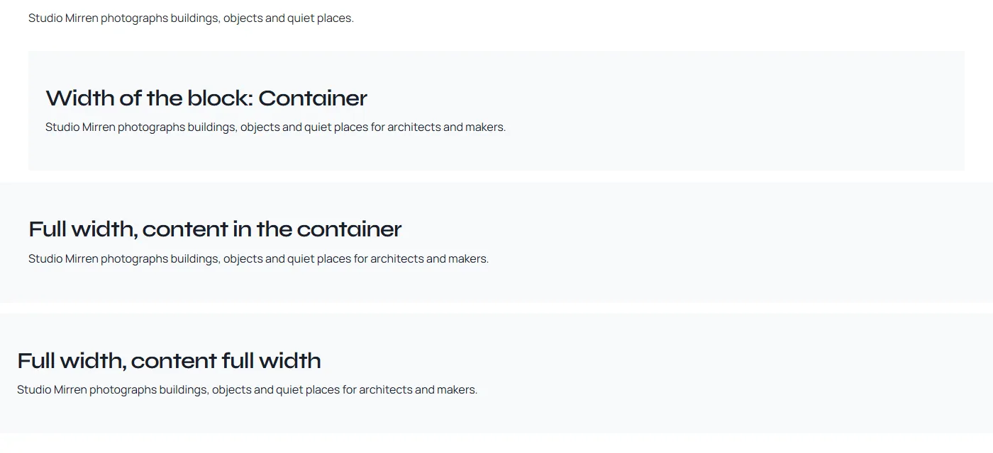
This was checked in the main column of Cassiopeia - Webal with no sidebar, and in the position bottom-a. The band ran from the left edge of the screen to the right edge, on a wide screen and on a phone. With Full width content, the words sat a little way in from the edge, because a block with its own background keeps some space inside it.
Tip. Do not use Full width in a column beside a sidebar. When this was tried, the band slid past the left edge of the screen, the start of every line was cut off, and the band stopped short of the right edge. Put the band in a position above or below the sidebars, such as bottom-a, or use a full-width section of a layout: see Let a section's colour run from edge to edge.
Space above, below and inside
Space is set in two places. Both use the same steps: 0 (none), 1 (0.25 rem), 2 (0.5 rem), 3 (1 rem), 4 (1.5 rem) and 5 (3 rem). Inherit keeps your template's own space.
- Space above and below, in the General group, sets the space outside the block, above and below it, with one choice.
- The Spacing group sets each side on its own: Space outside (top, bottom, left and right) and Space inside (top, bottom, left and right).
When both are set, the Spacing group wins for the side it sets. For example, with Space above and below at 5 and Space outside: top at 0, there was no space above the block and 3 rem (48 pixels) below it.
Space inside is the room between the edge of the block and its words. It shows best on a block with a background colour or picture. On such a block, Space inside 5 put the words 3 rem in from each edge of the coloured area. Blocks with their own background already get some space inside from the Webal Blocks Options: see Surface padding and page width.
For left and right, the Spacing group also offers Automatic (pushes to the centre or the edge). It centres a block that has a maximum width, as shown in Centre a block at a narrower width.
Show or hide a block on some screen sizes
- In the General group, open Visibility.
- To hide the block on phones, choose a Hidden below choice, such as Hidden below md (visible from 768 px). The block then shows from that width up.
- To show the block on phones only, choose an Only below choice, such as Only below md (hidden from 768 px). The block then disappears from that width up.
- Press Save.
With Hidden below md, the block was gone on a phone 390 pixels wide and showed on a wide screen. Only below md did the opposite. The widths use the Bootstrap names: sm is 576 pixels, md 768, lg 992, xl 1200 and xxl 1400.
To hide a module on some pages, use Menu Assignment
Visibility only hides the block from view. It is still part of the page that the visitor's browser downloads. To keep a module off some pages, use Joomla's own Menu Assignment tab of the module instead:
- Open the module and its Menu Assignment tab.
- In Module Assignment, choose On all pages except those selected or Only on the pages selected.
- Tick the pages in the list, then press Save & Close.
Joomla then does not put the module on the other pages at all. Never hide a module on certain pages with your own CSS: the module is still made and sent with every page.
Halves, thirds and other exact widths
The module options do not split the page into columns. Maximum width gives four fixed widths, not fractions of the page. To put blocks side by side in halves, thirds, quarters or any number of twelfths, use columns in the Webal Layouts builder:
- A row of a section can have up to 12 columns, and each column holds module positions.
- You set the width of each column in twelfths, for each screen size: 6 twelfths is a half, 4 is a third and 3 is a quarter.
- Modules per row sets how many columns sit side by side on a phone, a tablet and a laptop.
Read Section, row, column, position, Modules per row and The resize bar. For columns beside a sidebar, read The Component, its sidebars and rows.