A layout is a plan for a page. This page explains the plan in the order that you build it, step by step, so that the words section, Component, row, column and position make sense before you press a single button.
The idea in one picture
Think of a page as a stack of bands, from the top of the screen to the bottom. Each band is a section. A section can be split into columns that sit side by side, or it can hold rows, one under the other, each with its own columns. Each column holds one or more positions, and each position is a named slot where a module can go.
- The layout is the whole page plan.
- Inside it, each section is one band across the page. It carries the background colour or picture, and the space above and below.
- Inside a section, a row is a line of columns. A section with one line of columns needs no rows. Add rows when you want several lines in one band that share its background.
- Inside a section or a row, each column is one part of that line, up to 12 side by side.
- Inside a column, each position is a named slot for modules.
So the full order is Section, then Row, then Column, then Position. Rows go one level deep only. Sections always stack from top to bottom: nothing sits beside a sidebar except rows inside the Component.
The builder decides where things go. The modules decide what goes there. You make the modules on Joomla's own Modules screen, and you tell each module which position to use.
The four words, and the special ones
| Word | What it is | Example |
|---|---|---|
| Section | A band across the page. It can have a colour or a picture, and space above and below. It holds columns, or rows. | A band with a heading and three boxes. |
| Column | A part of a section or a row, side by side with the others, and stacked on a phone unless you choose otherwise under Modules per row. | Three columns for three boxes. |
| Position | A named slot in a column. A module shows only in the position named in its own Position box. | A position called services. |
| Module | The content itself, made on the Modules screen of Joomla. It is not part of the layout. | A Cards module placed in services. |
| Page content | The special part that shows the article, or whatever the menu item points to. Every layout needs exactly one. | The text of the page. |
| Component | The special section that uses Cassiopeia's own page grid, with a main column and a sidebar. It is the section to use when a page needs a sidebar. A layout has at most one. | The page content with a sidebar on the right. |
| Row | A line of columns inside a section, or inside the main column of the Component. A row has its own columns and positions, one row under the other, and shares the background of its section. | A heading row, then a row of three cards, in one coloured band. |
Plan the page first
- List the bands of the page from top to bottom, for example: header, banner, introduction, services, call to action, footer.
- Mark the one band that is the page content, which is the text that you will write in an article.
- For every other band, decide which module will fill it, and give its position a short name in lower-case letters, such as
bannerorservices. - Decide which band needs a colour, and which pages need a sidebar.
A plan of five or six lines on paper saves a lot of clicking.
Build it, step by step
- Start. Open Components, then Webal Layouts, and press New layout. Type a name in Name of the new layout, choose Blank under Start from, and press Create and open in the builder. A blank layout holds only the site header and the site footer.
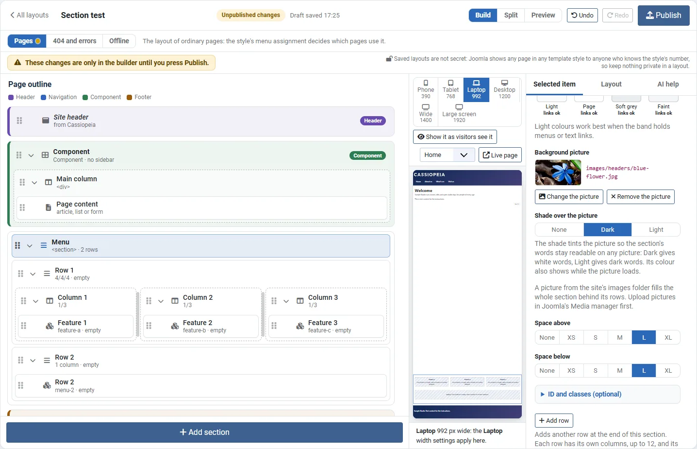
- Look at the outline. The list on the left is the outline. It shows every section from top to bottom, with its columns and positions inside it. The preview in the middle draws your real site with the layout that you have on screen.
- Add a section. Press Add section and choose a section template, such as Hero (full-width band), Colour band or Page content only. The new section appears in the outline and in the preview.
- Give the section a name. Click the section in the outline. On the Selected item tab, type a name in Name. The name is only for you, and it shows in the outline.
- Choose how wide the section is. Under Content width, choose Page width to line the content up with the header, or Edge to edge to let the content itself reach both edges of the screen. The section's colour runs the full width of the screen with either choice.
- Give the section a look. Choose a Background colour, or press Choose a picture for a background picture with a Shade over the picture, and set Space above and Space below. This is the place for breathing room: the space belongs to the section, so the bands of the page do not crowd each other.
- Add the columns. A new section has one column. Press Add column for more. Under Modules per row, choose how many columns sit side by side on a Phone, a Tablet and a Laptop. To set one column on its own, set its width for each screen size: Phone, Tablet, Laptop, Desktop and Wide. A size that you leave as "Same as" follows the one before it.
- Add rows, if the band needs more than one line. Press Add row in the section's settings. What the section holds becomes row 1, and row 2 follows. Each row has its own columns. See Sections with rows and pictures.
- Choose the column kind. Under Column kind, keep Ordinary column for most columns. Choose Stacked modules for a band that holds modules one under the other and that should fill its width: this is the best choice for a band that holds one module. Choose Page content column only for the column that holds the page content.
- Add the positions. Click the column, press Add position, and type a Position name such as
services. Use lower-case letters, digits, hyphens and underscores, and use each name only once in a layout. A column can hold up to eight positions, and the modules of each position stack one under the other. - Place the page content once. Click the column that should hold the words of the page and press Add page content. If you chose Page content only in step 3, it is there already. The builder allows only one, and the button is greyed out once it is placed.
- Add a sidebar, if the page needs one. Press Add section and choose Component with sidebar (right) or Component with sidebar (left). The Component uses Cassiopeia's own page grid. Its main column holds the page content, and you can press Add row to put more rows in the main column, one under the other. A layout can have only one Component. To give the content and the sidebar more room, choose Roomy or Spacious under Gap between main column and sidebar. See The Component, its sidebars and rows.
- Put the sections in reading order. Drag a section in the outline, or move it with the keyboard, until the order is the order that a visitor should read the page. Headings come from the modules and the page content, so the order of the sections is the order of the headings.
- Check. Open the Layout tab and read Checks. A problem stops Publish, and a warning does not. See The Checks tab.
- Publish. Press Publish. Nothing is live until you do.
- Use it. On the Layout tab, under Where this layout is used, tick the pages that should use the layout, press Review changes, read the list and press Apply these changes. See Using a layout.
- Fill the positions. Open Content, then Site Modules. For each module, type the position name in Position exactly as you wrote it in the builder, and set the Menu Assignment to the pages that should show it.
One layout can serve the whole site. A section whose modules do not show on a page prints nothing on that page, so each module's Menu Assignment decides what each page shows. Make a second layout only where a page's structure truly differs. See Empty parts print nothing.
Tip. The same position can hold a different module on each page. A position called banner can show one banner on the home page and another banner on the contact page, because each module has its own Menu Assignment.
A worked example: a menu band
A café wants one band for its menu, on a photograph of the counter: a row with a heading, then a row of three dishes. On a phone the dishes should stand one under the other, on a tablet two should sit side by side, and on a laptop all three.
| Part | Holds | Settings |
|---|---|---|
| Section: Menu | Two rows | A background picture, the shade Dark, and a larger step for Space above and Space below |
| Row 1 | One column with the position menu-heading | Nothing to change |
| Row 2 | Three columns with the positions dish-1, dish-2 and dish-3 | Modules per row: Phone 1, Tablet 2, Laptop 3 |
- Press Add section and choose Colour band. Name it Menu.
- Press Choose a picture and choose the photograph from the list. If it is not there, upload it in Joomla's Media manager first. The shade starts as Dark, so the words will be white.
- Press Add row. The band's column becomes row 1, and row 2 is added under it. Click the position in row 1 and type
menu-headingin Position name. - Click row 2 and press Add column twice, so that it has three columns. Give the positions the names
dish-1,dish-2anddish-3. - With row 2 selected, under Modules per row, choose 1 for Phone, 2 for Tablet and 3 for Laptop. The columns now print
col-12 col-md-6 col-lg-4, and Desktop and Wide keep 3. - Look at the preview at Phone, Tablet and Laptop, then press Publish.
- Under Modules, put a Heading module in
menu-headingand a module for each dish indish-1,dish-2anddish-3. Assign them to the pages that should show the menu.
On a page where none of these modules is assigned, the whole Menu section, with its picture and its space, prints nothing.
The muddles, cleared up
| The muddle | The answer |
|---|---|
| Section, Component or row? | A section is any band of the page. The Component is the one special section with the main column and the sidebars. A row is a line of columns inside a section or inside the Component's main column. Earlier versions of the builder used the words differently: see Words used for layouts. |
Is a section the same as the HTML <section>? | Not always. A section prints the element that you choose under Page element. The choice Page part (section) prints <section>; other choices print <header>, <footer> or a plain <div>. The <nav> comes from the menu module itself, inside the header, as in Cassiopeia. |
| Position or module? | The position is the slot, and it belongs to the layout. The module is the content, and it belongs to Joomla. Nothing shows until a module names the position. |
| Why does my band not show? | A position with no module for the page prints nothing, and a section with nothing in it is left out, with its colour, picture and space. Check the module's Position box, its Menu Assignment and that it is published. |
| Why is my module narrow? | A module in an ordinary column is as wide as its content. Choose Stacked modules as the column kind so that it fills the width. |
| Where does the colour go? | On the section, under Background, when the band should be one flat colour with space around it, or under Background picture for a photograph behind all its rows. A module can also have its own background, which is the better place for a gradient, or for a picture behind one module only. |
| Can a section sit beside the sidebar? | No. Sections are full-width bands, stacked from top to bottom. Content beside a sidebar goes in rows inside the Component. |
| The sidebar is too close to the content | Click the Component and choose Roomy or Spacious under Gap between main column and sidebar. An ordinary section has its own Gap between columns instead. |
| How many page contents? | Exactly one in a layout for pages. Two is refused, and none is refused. |
Try it
- Make a new layout called Try sections, starting from Blank.
- Press Add section and choose Hero (full-width band). Name it Banner.
- Add a second section, Page content only. Name it Words.
- Add a third section, Colour band. Name it Boxes, then give it a Background and set Space above and Space below to a larger step.
- In the Boxes section, press Add column twice, so that it has three columns, and add a position to each one:
box-a,box-bandbox-c. - Read Checks on the Layout tab. It should say that everything looks right.
- Press Undo a few times to see how the plan comes apart one step at a time, then press Redo to bring it back.