The Component is the way to make a page with a sidebar. It is a special section that uses Cassiopeia's own page grid, so the main column and the sidebar behave as they do on a standard Cassiopeia page. Inside the main column you can add rows, one under the other, each with its own colour and columns.
Any other section can hold rows too, as Sections with rows and pictures explains. The Component is the one with the sidebars. Sections are full-width bands and do not wrap around a sidebar, so content that should sit beside the sidebar goes in rows inside the Component.
Earlier versions of the builder called the Component a "Section", and its rows "stacked rows". Older layouts show the new words, and nothing in a saved layout changes.
Why use the Component
The Component prints the same page code as a standard Cassiopeia page, so it adds no extra levels to the page. By default Cassiopeia sets the widths: a sidebar takes a quarter of the page on a wide screen, and the main column takes the rest. You can change that with Sidebar width. The Component is as tall as its taller side.
The older way, a section with unequal columns, still exists. It needs two more levels of page code than the Component. A sidebar in such a section also loses its usual gap when it stacks under the content on a phone, unless you type the classes pb-3 pb-lg-0 in the section's Classes box. The editor tells you this.
Add the Component
- In the editor, press Add section.
- Choose Component with sidebar (right), Component with sidebar (left) or Component, no sidebar. The three are marked "Cassiopeia's own page grid".
- In the outline, click the Component. It is marked in green, with the badge Component. Its settings are the same as those of any section: background, space above and below, ID and classes.
A layout can have only one Component. After you add one, the three Component templates are greyed out, and when you hover over one it says "A layout can have only one Component."
Add rows in the main column
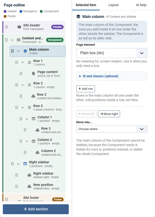
- In the outline, click Main column. This is the big middle column of the Component.
- Press Add row. The page content moves into a first row, and a second row with one position follows. Nothing is lost. The new row is selected.
- For a third row, click Main column again and press Add row, and so on.
- Click each row to change its settings.
Add the Component with a sidebar and rows: a short video with no sound. Its steps:
- Open the Components menu.
- Choose Webal Layouts.
- Press Open in the builder beside Section test.
- Press Add section.
- Choose Component with sidebar (right).
- Click Main column in the outline.
- Press Add row.
- Click Main column in the outline again.
- Press Add row again.
- Click Row 2 in the outline.
- Under Background, choose Light.
- Click Right sidebar in the outline.
- Press Add position.
- Look at the preview: three rows beside the sidebar.
Each row has its own name, background, Space above and Space below, Gap from the row above, Gap between columns, Equal columns, ID and classes. Gap from the row above set to Usual is Cassiopeia's own small gap between rows. None makes two coloured rows touch.
A row with one column shows its positions straight under it in the outline. A row with several columns shows each column. Click Add column on a row to make two or three columns, or switch on Equal columns. With two or more columns that are not equal columns, Modules per row chooses how many sit side by side on a Phone, a Tablet and a Laptop.
Move rows between the Component and sections
Drag a row from the main column to a section that holds rows, or the other way round, or select the row and press Move into... in its settings. A column of a row can be dragged to another row. Module positions keep their names on every move, so the modules in them keep showing after Publish. Only Duplicate gives the copy new position names, on purpose.
What a row can hold
- Module positions.
- The page content, but not among equal columns.
- The breadcrumb trail, once in the whole layout.
Rows cannot hold more rows, so rows go one level deep only. A main column holds up to 12 rows, and a layout holds up to 60 rows in all.
Why a new row starts with some space
A new row starts with a little space above and below it. The editor says why: "so you can see and select it in the preview; set Space above and Space below to None for a plain row."
The sidebar
Click Right sidebar (or Left sidebar) in the outline, and press Add position. A sidebar holds up to 8 positions, and the modules of each position stack one under the other.
On the Component itself, the setting Sidebars offers None, Left, Right and Both.
- Moving the sidebar from right to left keeps its positions. A message says so.
- Taking the sidebar out removes its positions too. A message says so, and Undo brings them back.
- A sidebar needs at least one position. To take the sidebar away, choose None for Sidebars.
A sidebar with nothing to show on the live page is left out, and the rows use the full width. See Empty parts print nothing.
In the Build view of the editor, the Component is drawn at Cassiopeia's widths for the screen size chosen in the preview: from 992 pixels up, the sidebar takes its width (a quarter, or the twelfths set under Sidebar width) beside the main column, and below that every column is full width. In the Build view you can drag the bar between the main column and a sidebar to change its width. See The layout editor.
Sidebar width
A sidebar takes Cassiopeia's own quarter of the page column (3 twelfths) unless you choose another width. The width counts from the Laptop size (992 pixels) up; below it the sidebars sit under the content, as in Cassiopeia.
- Click the Component in the outline.
- Under Sidebar width, press 2, 3 (usual), 4, 5 or 6. Each sidebar takes that many twelfths, and the main column takes the rest.
- Or, in the Build view, drag the bar between the main column and the sidebar. Each twelfth you drag changes the width by one. Undo puts it back.
With sidebars on both sides, each can take at most 4 twelfths, so the main column keeps at least a third of the page. A sidebar with nothing to show on a page still leaves the main column the whole width.
For developers. The width is printed as the class wbll-sw- plus the Component's handle, with one scoped rule added through Joomla's Web Asset Manager: from 992 pixels up the Component's grid gets twelve tracks instead of Cassiopeia's four, adding up to the same width (Webal Blocks' Wide page width is followed too). A layout without a sidebar width prints exactly as before.
Space between the content and the sidebar
Cassiopeia leaves 16 pixels between the page content and the sidebar. When both sides hold boxes, such as cards and a form, that can look tight. The Component has its own setting for it.
- Click the Component in the outline.
- Find Gap between main column and sidebar.
- For most pages, press one of the quick choices:
- Usual keeps Cassiopeia's own 16 pixels.
- Roomy gives 8 pixels on phones and tablets, and 24 pixels from laptops up.
- Spacious gives 8 pixels on phones and tablets, 24 pixels on laptops, and 48 pixels on the widest screens.
- To choose the space yourself, use the line for each screen size: Phone, Tablet, Laptop, Desktop and Wide. Each line offers None, 4 px, 8 px, 16 px, 24 px and 48 px, and a size left as Same as follows the size before it.
- Look at the preview at Desktop and Wide to see the result, then press Publish.
On a phone the sidebar sits under the content, and the same step separates them. A large step also takes width from both sides, so keep 48 pixels for laptops and wider screens: at a laptop width of 992 pixels it leaves the sidebar less than 200 pixels wide.
The steps are Bootstrap's own, the same that Cassiopeia uses everywhere, so the page stays native and works with any extension that shows its own content in the page content. There is no step between 24 and 48 pixels.
Position names in a sidebar
If you rename a sidebar position
The starting positions of a sidebar are called sidebar-left and sidebar-right, the same as in Cassiopeia. A module shows only in the position that it is assigned to. So if you rename a sidebar position, the modules that you already put in sidebar-right or sidebar-left no longer show in that sidebar. Move them to the new name, in the Position box of each module under Modules.
A small known difference in the second position
Cassiopeia gives the first and the last module of a sidebar a little extra space at the top and at the bottom. It decides this by the name of the position, and only for sidebar-left and sidebar-right. So in the second and later positions of a sidebar, and in a first position that you have renamed, the modules do not get that space.
We measured this on 5 November 2026. A tall module in a second position made the layout page 16 pixels shorter than the same content on a standard Cassiopeia page. The first module of a sidebar gets space above it, and the last module gets space below it, only in those two named positions. In a second position that space is missing, and in our check the page was 16 pixels shorter.
If this matters to you, type a spacing class in the Classes box of the sidebar, under ID and classes (optional). For example, pb-3 adds 1 rem of space at the bottom of the sidebar. In our check, we added this class to the sidebar in the browser, on a page at phone width, and the sidebar became 16 pixels taller. We did not try it by typing it in the editor and publishing.
Try it
- Open Components, then Webal Layouts, press New layout, choose Blank in Start from, and press Create and open in the builder. The Landing page and Blog presets already contain a Component, and a layout can have only one.
- Press Add section, and choose Component with sidebar (right).
- Click Main column in the outline, and press Add row. Then click Main column again and press Add row again.
- Click Row 2, and choose a Background. The preview shows a coloured band.
- Click Right sidebar, and press Add position twice.
- Click the Component, press Roomy under Gap between main column and sidebar, and look at the preview at Desktop.
- Click the Component, and set Sidebars to Left. A message says that the positions came with the sidebar.
- Press Undo to put the sidebar back.