Any section of a page can hold rows, one under the other, and any section can have a background picture. Together they let you group related modules in one styled band: the section carries the background and the spacing, and the rows inside it share them. This page shows how to do both, and how to choose the number of modules side by side on each screen size.
Section, row, column, position
A page is a stack of sections, from the top of the screen to the bottom. Inside a section there are two choices.
- Columns side by side, as before. Each column holds positions.
- Rows one under the other. Each row has its own columns, up to 12, and each column holds positions.
So the full order is: Section, then Rows, then Columns, then Positions. Rows go one level deep only: a row cannot hold more rows.
Sections always stay full-width bands stacked from top to bottom. They do not wrap around a sidebar. For content beside a sidebar, use rows inside the Component. See The Component, its sidebars and rows.
Turn a section into rows
- Choose the page type Pages. Rows in a section are not offered on the 404 and errors or Offline page types.
- Click the section in the outline.
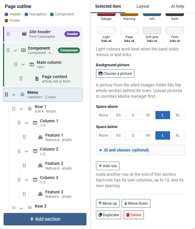
- Press Add row in its settings.
- The first time, what the section holds now becomes its first row, so the page looks the same. If the section has several columns, those columns become the first row, with their settings such as equal columns and the gap between them. A new row with one position is added under it.
- If the section already holds rows, a new row is added at the end.
- A column holds up to 12 rows, and a layout holds up to 60 rows in all.
The outline then lists the section's rows straight under the section. The column that holds them is not shown, because it is only the holder.
A section whose column is the page content column cannot be turned into rows. The editor says "This section has the page content column, which belongs to the section itself, so it cannot be turned into rows. Use the Component for content with rows."
The site navigation
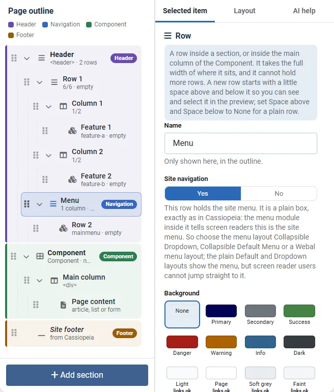
As in Cassiopeia, the header holds the site navigation: the logo first, then the menu, all inside the header.
- Add a section and set its Page element to Header band.
- Press Add row, so the section holds rows: for example one for the logo and one for the menu.
- Click the row for the menu and set Site navigation to Yes. Its positions are named
mainmenu. - Under Modules, put your menu module in that position.
- A layout has one site navigation. The editor refuses a second one and says which row already is it. A section that holds the site navigation cannot be duplicated, so add a new section instead.
- The switch is offered only on rows inside a Header band. A layout that has the site navigation anywhere else, or a Navigation section from an older layout, still works, and the Layout tab says where it now belongs.
- The Header band prints Cassiopeia's own header, so the Webal navbar's Sticky and colours options, such as Keep the bar in view and See-through bar over a picture, work there as on any Cassiopeia site.
- Every page drawn from a layout starts with its own skip link, "Skip to the main content", which takes keyboard users to the Main content section, so you do not need a skip-link module.
Limit: the Site navigation row is a plain box, exactly as in Cassiopeia. The menu module inside it is what tells screen readers "this is the site menu". So choose the menu layout Collapsible Dropdown, Collapsible Default Menu or a Webal menu layout. The plain Default and Dropdown layouts show the menu, but screen reader users cannot jump straight to it.
Move rows and columns
- Drag a row to another section that holds rows, or into the main column of the Component. You can also select the row and press Move into... in its settings, then choose the new place from the list.
- Drag a column of a row to another row.
- Module positions keep their names on every move, so the modules in them keep showing after you press Publish. Joomla's modules follow the position name, not the place in the layout.
- Only Duplicate gives the copy new position names, on purpose, so that a name is never used twice.
Publish stores the layout in the template style. It never changes a module.
Modules per row
A row (or a section of columns) with two or more columns that are not equal columns has the setting Modules per row. For Phone, Tablet and Laptop, choose how many columns sit side by side: 1, 2, 3, 4 or 6. The rest stack underneath.
- It writes Bootstrap's own column classes on every column of the row. For example, Phone 1, Tablet 2 and Laptop 3 prints
col-12 col-md-6 col-lg-4. - A larger screen keeps the number of the size below it until you choose another number for it.
- You can still set the width of a single column for each screen size in that column's settings.
The resize bar
In the Build view, on an administrator window 992 pixels wide or more, a bar sits between two columns of a row. Drag it to move twelfths from one column to the other. The change applies to the screen size that the preview is showing: Phone, Tablet, Laptop, Desktop, Wide or Large screen. Undo puts it back. If you prefer not to drag, set the same widths in the settings of each column.
A background picture
A section can have a picture behind its rows or columns. A row cannot have a picture of its own: it shares the picture of its section.
- First upload the picture in Joomla's Media manager, in the
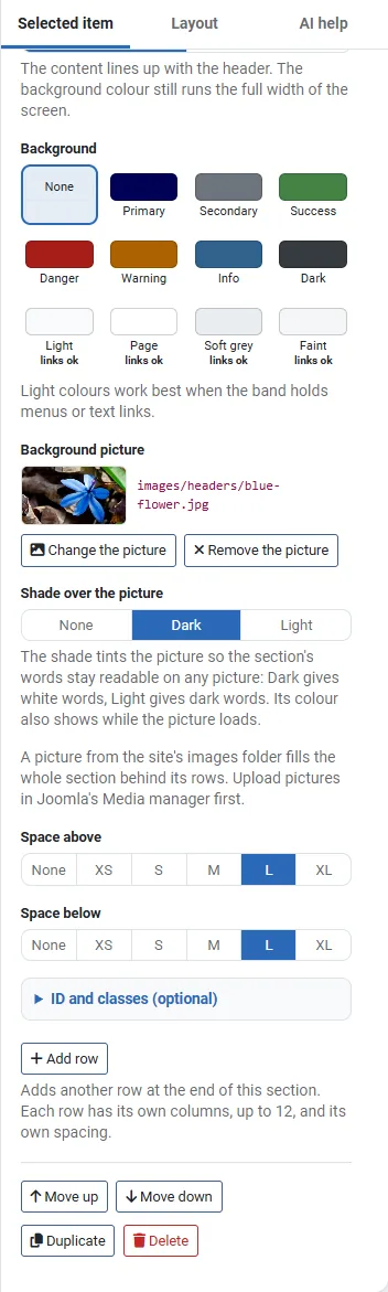
imagesfolder or a folder inside it. - Click the section, and under Background picture press Choose a picture.
- A list of the pictures in the site's
imagesfolder appears. Type part of a name or folder in Find a picture by name or folder to narrow the list, and choose one. - Choose the Shade over the picture. A new picture starts with Dark.
The buttons Change the picture and Remove the picture appear once a picture is chosen. The picture fills the whole section, cropped to fit and centred. The files allowed are jpg, jpeg, png, webp, avif, gif and svg, inside images/.
| Shade | What it does |
|---|---|
| Dark | Tints the picture with 60 % black, and the words are white. This keeps white words readable on any picture. |
| Light | Tints the picture with 80 % white, and the words are dark. |
| None | The picture as it is. Use it only when nothing in the section is text. |
The colour of the shade also shows while the picture loads. A picture without a shade gets a warning in Checks: "... has a background picture without a shade. Words over a picture can be hard to read, so choose a dark or a light shade unless nothing in this section is text." See Colours and user.css for more about contrast.
Let a section's colour run from edge to edge
A section is always a full-width band. To make its colour run from one edge of the screen to the other while its content keeps the page width, set its width and its background.
- Go to Components > Webal Layouts and press Open in the builder beside the layout.
- Click the section in the outline. Pick the section itself, not a row: a row has no Content width setting.
- Under Content width, choose Page width. Its hint says: "The content lines up with the header. The background colour still runs the full width of the screen." Edge to edge does something else: it lets the content itself reach both edges, which suits a picture or a slideshow.
- Under Background, choose a colour, for example Faint for a pale tint.
- Press Publish.
Let a section's colour run from edge to edge: a short video with no sound. Its steps:
- Open the Components menu.
- Choose Webal Layouts.
- Press Open in the builder beside webal.net Home.
- Click the section in the outline (here Section 3, a pale band).
- Content width, Edge to edge: the content itself reaches both edges of the screen.
- Content width, Page width: the content lines up with the header, and the colour still runs the full width.
- Under Background, choose a colour: Faint gives a pale tint.
- Press Publish to show the change on the site.
If the part you want coloured is a row inside a section, give it a section of its own. Press Add section and choose Colour band, and put the new section in place with Move up. Then select each position of the row and choose the new section under Move into..., or drag the position there. Delete the empty row, and the new section's own position if you do not need it. Module positions keep their names, so the modules keep showing.
The trade-off: only one section can have the Page element Main content, so the modules in your other sections sit outside the page's main element.
For your own brand tint, restyle the standard class in the child theme's user.css, for example:
.bg-body-tertiary { background-color: var(--site-tint) !important; }Define --site-tint for light colours and again for dark colours, or the band stays pale on a dark page. Where the file goes, the dark-mode trap and the simpler setting --tertiary-bg-rgb are explained in Colours and user.css.
An empty section prints nothing
A section prints nothing at all, not even its picture, colour or spacing, on a page where none of its rows shows a module. An empty row drops out, and the next row moves up with no gap above it. See Empty parts print nothing.
A worked example
For a whole band built step by step, with a picture, a heading row and a row of three dishes (Phone 1, Tablet 2, Laptop 3), see How a page is built, step by step.
Try it
- Open a layout, choose Pages, and click a section that has two or three columns.
- Press Add row. The columns become row 1, and the preview looks the same. A row 2 is added under it.
- Click row 1 and try Modules per row. Watch the preview at Phone, Tablet and Laptop.
- Click the section, press Choose a picture, and choose a picture from the list.
- Set Shade over the picture to None, and read the warning on the Layout tab. Set it back to Dark.
- Press Undo a few times to go back.