Most Webal modules have the same few groups of options. They look and work the same in every module, so this page explains them once. Not every module has every group: each module page says which groups it has.
This page lists every option. To see how to use them for a job, such as centring a block or hiding it on phones, read Placing a block: width, alignment and space.
Tip. You can leave every shared group as it is, because the defaults follow your theme. Change a group only when you want the block to look different.
General
This group is on the Layout tab, and it sets how the block lines up, how wide it is and when it shows.
| Option | What it does | Default |
|---|---|---|
| Text alignment | How the text lines up: Inherit, Left, Centre or Right. Left and Right swap places on right-to-left sites. | Inherit |
| Alignment applies from | The screen width from which the alignment applies, from All sizes up to Extra extra large and up (1400 px). | All sizes |
| Alignment below that width | How the text lines up on screens narrower than that width. | Inherit |
| Maximum width | Stops the block growing wider than 30, 45, 60 or 75 rem. None means the full width available. | None (full width) |
| Position of a narrower block | Left, Centre or Right. Where a block with a maximum width sits in its space. Shown once you choose a maximum width. It is ignored when Space outside: left and right in the Spacing group is set to a number. | Left |
| Space above and below | Space outside the block, above and below, from 0 to 5 on the Bootstrap spacing scale. Inherit leaves your theme alone. | Inherit |
| Visibility | Shows or hides the block on some screen widths. "Hidden below" means it appears from that width up. "Only below" means it disappears from that width up. | Always visible |
| Extra attributes | Up to three extra HTML attributes for the wrapper. For developers and power users. Skip it if you are not sure. | None |
| CSS class | Extra class names for the wrapper, so that your template can style this block. | Empty |
| Element ID | A unique id for the wrapper, so that a link can jump to this block. Start with a letter. | Empty |
| Wrapper element | The HTML element around the block. Section and Aside are landmarks: screen readers announce them by the block's title. Choose Plain block (no landmark) only when the block sits inside content that already has one, for example in the middle of an article. | Section |
The screen widths use the Bootstrap names: sm is 576 px, md 768 px, lg 992 px, xl 1200 px and xxl 1400 px.
Spacing
This group is on the Layout tab, and it sets the space outside and inside the block on each side. The scale runs from 0 (none) to 5 (3 rem), and Inherit leaves your theme alone.
| Option | What it does | Default |
|---|---|---|
| Space outside: top | Space above the block. | Inherit |
| Space outside: bottom | Space below the block. | Inherit |
| Space outside: left and right | Space at the sides. Automatic centres a block that has a maximum width. | Inherit |
| Space inside: top | Space between the top edge of the block and its content. | Inherit |
| Space inside: bottom | Space between the bottom edge and the content. | Inherit |
| Space inside: left and right | Space between the side edges and the content. | Inherit |
Width
This group is on the Layout tab of modules that can run edge to edge.
| Option | What it does | Default |
|---|---|---|
| Width of the block | Container keeps the block as wide as the place it sits in. Full width, edge to edge runs the block, and any background you gave it, from the left edge of the screen to the right edge. | Container |
| Width of the content | Shown when the block is full width. Container keeps the words, pictures and buttons inside the normal page width. Full lets them run to the edges too. | Container |
Tip. Full width works by itself in the top and bottom positions of your template. Inside an article or a column it works when that place is centred on the screen. Beside a sidebar it does not: the band slides past the left edge of the screen and the start of each line is cut off. For the cleanest result, set Module Style on the Advanced tab to None.
Colour scheme
This group is on the Layout tab, and it is a single choice.
| Option | What it does | Default |
|---|---|---|
| Colour scheme | Inherit follows the site colour mode. Light and Dark always use that set of colours, whatever the rest of the page does. The block then paints its own background and padding so the text stays easy to read. | Inherit |
Tip. If the block sits in a part of your template that is painted dark, such as the footer of the standard template, choose Dark. The fixed text colours Dark, Light and White do not follow the scheme.
Background
This group is on the Layout tab of modules that can have a band behind them, such as a hero. You can set a picture, a colour, a gradient and an overlay, and the form checks that your text colour stays readable.
| Option | What it does | Default |
|---|---|---|
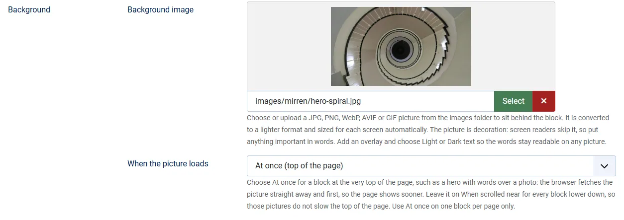
| Background image | A JPG, PNG, WebP, AVIF or GIF picture from your images folder. It is made lighter and sized for each screen automatically. It is decoration: screen readers skip it. | None |
| When the picture loads | Shows once you have chosen a background image. Choose At once (top of the page) for a block at the very top of the page, such as a hero with words over a photo: the browser fetches the picture straight away and first, so the page shows sooner. Leave it on When scrolled near (usual) for every block lower down, so those pictures do not slow the top of the page. Use At once on one block per page only. | When scrolled near (usual) |
| Focal point: across (percent) | The part of the picture to keep in view when it is cropped: 0 is the left edge, 100 the right. | 50 |
| Focal point: down (percent) | The same, from the top (0) to the bottom (100). | 50 |
| Image size | Cover fills the block and crops the edges. Contain shows the whole picture. Auto uses the picture at its own size. | Cover |
| Image position | Where a smaller picture sits in the block. | Centre |
| Image effect | None, Fixed (the picture stays still as the page scrolls) or Parallax (it moves more slowly than the page). Both are off for visitors who prefer less motion. | None |
| Background colour | A solid colour behind the block. Colours do not change with the light and dark mode, except Primary. | Inherit |
| Your own background colour | Shown when you choose My own colour. | Empty |
| Gradient | A smooth change between two colours, in the direction you choose. | No gradient |
| Gradient: first colour | The colour at the start. Both colours are needed. | Empty |
| Gradient: second colour | The colour at the end. | Empty |
| Overlay colour | A colour laid over the picture so text stays readable. Leave it empty for no overlay. | Empty |
| Overlay strength (percent) | From 0 (clear) to 100 (solid). | 40 |
| Blend mode | How the overlay mixes with the picture. Normal simply covers it. | Normal |
| Minimum height | None, Small (20 rem), Medium (30 rem), Large (40 rem) or Full screen height. | None |
| Space inside | Space above and below the content. | Inherit |
| Vertical position of the content | Top, Middle or Bottom, when the block is taller than its content. | Top |
| Text colour | Light text for a dark background, Dark text for a light one. The form refuses a choice that is hard to read. Inherit lets Webal Blocks pick one that can be read. | Inherit |
Animation
This group is on the Animation tab, and it plays an effect when the block scrolls into view. Visitors whose device asks for less motion see the content straight away.
| Option | What it does | Default |
|---|---|---|
| Entrance effect | None, Fade in, Grow in, Shrink in, Slow zoom (for images), or a fade that slides in from the start, the end, the top, the bottom, the left or the right. Each slide comes in four sizes: small, medium, large and full. | None |
| When it plays | When it scrolls into view (once), when it scrolls into view (every time), or when the page loads. | When it scrolls into view (once) |
| Delay (milliseconds) | How long to wait before the effect starts, from 0 to 5000. | 0 |
| Duration (milliseconds) | How long the effect lasts, from 50 to 5000. Leave it at 0 to use the site default from the Webal Blocks options. | 0 |
| Animate | The whole block, or each item in turn. Each item in turn works only in modules that are made of repeated items. | The whole block |
| Gap between items (milliseconds) | How long each item waits after the one before it. Shown when you animate each item. | 100 |
| Quick version | Plays the effect in a fifth of the usual time. | No |
Tip. Do not animate the main heading or the top picture of a page, because animated content stays invisible until the page scripts have started, and the page can feel slower.
Parallax
This group is on the Animation tab of some modules. Parallax moves a part of the page as the visitor scrolls. Leave Move with the scroll on No (the default) if you do not want it, and everything below it shows only when you choose Yes.
| Option | What it does | Default |
|---|---|---|
| Move with the scroll | Yes makes this part move as the page scrolls. | No |
| Sideways: at the start / at the end | How far it moves sideways when it first appears and when it leaves. A number of pixels, or a number with %, vw or vh. Leave blank for no movement. | Blank |
| Up and down: at the start / at the end | The same, up and down. | Blank |
| Size: at the start / at the end | Its size as a multiple of normal: 1 is normal, 0.5 is half, 2 is double. | Blank |
| Turn: at the start / at the end (degrees) | How far it is turned, from -720 to 720. Positive numbers turn it clockwise. | Blank |
| Fade: at the start / at the end (0 to 1) | How solid it is: 0 is invisible, 1 is fully solid. | Blank |
| Size and turn around | The point that stays still while it changes size or turns. | Centre |
| Speed curve | A number from -2 to 2. 0 moves at an even speed. | 0 |
| Starts at (% of the scroll) | Where in its pass across the screen the movement begins. | 0 |
| Ends at (% of the scroll) | Where the movement finishes. It must be higher than the start. | 100 |
| Run from screen width | The smallest screen width the movement runs on. Below it the part stays still. Phones are the usual place to switch it off. | All screen sizes |
Title
This group is on the Module tab of modules that print a heading of their own. If you type a title here, set the Joomla Title switch (Show Title) to Hide, because otherwise your template adds a second heading above it.
| Option | What it does | Default |
|---|---|---|
| Title text | The words shown as the title. Leave it empty for no title. | Empty |
| Heading level | The level of the heading, from Heading level 1 to Heading level 6, or Plain text (not a heading). Pick the level that fits the outline of the page. Do not skip levels. This does not change how big the title looks. | Heading level 2 |
| Look | How large and heavy the title looks. Inherit matches the heading level. | Inherit |
| Decoration | None, a short divider line under the title, a round bullet beside it, or a line running beside it. | None |
| Alignment | Where the title sits. | Inherit |
| Colour | The title colour. Choose My own colour to set your own. | Inherit |
| Your own colour | Used only if it is easy to read on the page. If not, the theme's text colour is used. | Empty |
| Your own colour in dark mode | Optional. The same, for dark mode. | Empty |
Link
A link group appears wherever a title, a picture or a button can link somewhere.
| Option | What it does | Default |
|---|---|---|
| Link to | Nothing (no link), A menu item (a page of this site), An article, or A web address (URL). | Nothing (no link) |
| Menu item | The page of this site to link to. | None |
| Article | The article to link to. | None |
| Web address | A full address such as https://example.com/page, an email link, a phone link, or a path on this site that starts with a slash, such as /contact. | Empty |
| Open in a new tab | Yes opens the link in a new tab. Screen reader users are told. | No |
| Link relationship | For web addresses: Normal link, No follow, Sponsored, or No follow and sponsored. | Normal link |
| Accessible name | Optional. A label for screen readers when the link words are not clear on their own. It must contain the words people see. | Empty |