A layout is made of rows. A row holds columns side by side, and a column holds blocks, one under the other. One tab group may sit in a column and hold content blocks. Nothing goes deeper than that.
The blocks
The palette groups the blocks by what they do: the gallery; the product (title, price, manufacturer, tags and so on); buying (Add to cart, stock, delivery date, quantities, watchdog, size chart); actions (compare, wish list, download, external link, ask a question); content (description, features, video, specification, reviews, related products, price history, custom fields); navigation (back to the list, previous and next); places (module positions and plugin areas); and the rows and containers.
A layout needs exactly one Add to cart block, which keeps Phoca Cart's whole buying form together (options, quantity and button). Each other part of the page can be placed once.
Rows
Select a row to see its settings:
- Width: Page width, or a Full width band, whose background colour reaches the edges of the window while its content keeps the page width. A full width band needs a background colour, or the checks warn.
- Background: one of four light colours of your template, so text stays readable.
- Space above and Space below.
- Order on phones: changes where the row shows below Tablet size. Screen readers and keyboards still follow the outline, so the checks warn when this moves the Add to cart block away from its place in the outline.
Columns
- Width at each screen size, in twelfths (see The builder).
- Order at each screen size: like the row order, it changes only where the column shows.
- Stays in view while scrolling: the column stays in view while the column beside it scrolls past, from the size you choose up. It only moves when the column beside it is taller. It cannot be used where the column is full width, or where its row wraps onto two lines; the builder says so.
Watch it: column widths and sticky
A video of about 27 seconds, with no sound (MP4; also as WebM). Its steps:
- In the builder, press Laptop above the preview.
- Select Column 2 of the row in the outline.
- In Width at each screen size, set Laptop (992 px) to 8 of 12.
- Select Column 1.
- Set its Laptop (992 px) width to 4 of 12.
- In Stays in view while scrolling, choose Sticky from Laptop (992 px).
- The preview shows the new widths at Laptop size.
- The outline shows the column's new width and that it stays in view.
Split pane
A Split pane is a row of two columns with a bar between them, for example seven and five twelfths. Choose Where the columns stack: below that size the two columns are full width, one under the other.
Tab group
A Tab group holds content blocks. In Look at each screen size, choose for each size:
- Tabs: one part shown at a time, chosen with its tab;
- Accordion: each part opens and closes under its heading;
- Sections, one under the other: every part open, one after another.
Every part is always on the page, whichever look is chosen. Without scripts, tabs show as sections.
Text size
The title, the price and every text block have a Text size:
- As the template sets it (the default);
- Small, Normal, Large, Extra large or Display: each grows smoothly from phones to wide screens;
- Your own: the smallest size, on phones, and the largest, on wide screens, in rem (a rem is the visitor's own text size). The smallest is at least 0.875 rem, and the largest is at most two and a half times the smallest. This limit keeps text that visitors can still enlarge to twice its size with their browser.
The title and the price also have weight, line height and letter spacing. The checks warn when the title is smaller than text under it.
Heading levels
The page needs one main heading, normally the product's title. Its Heading level is chosen separately from its text size. In The whole page, Heading level of the content sections sets the headings above the description, reviews and other content. With the title as the main heading, keep the sections one level below it; the checks warn when a level is skipped.
Plugin areas
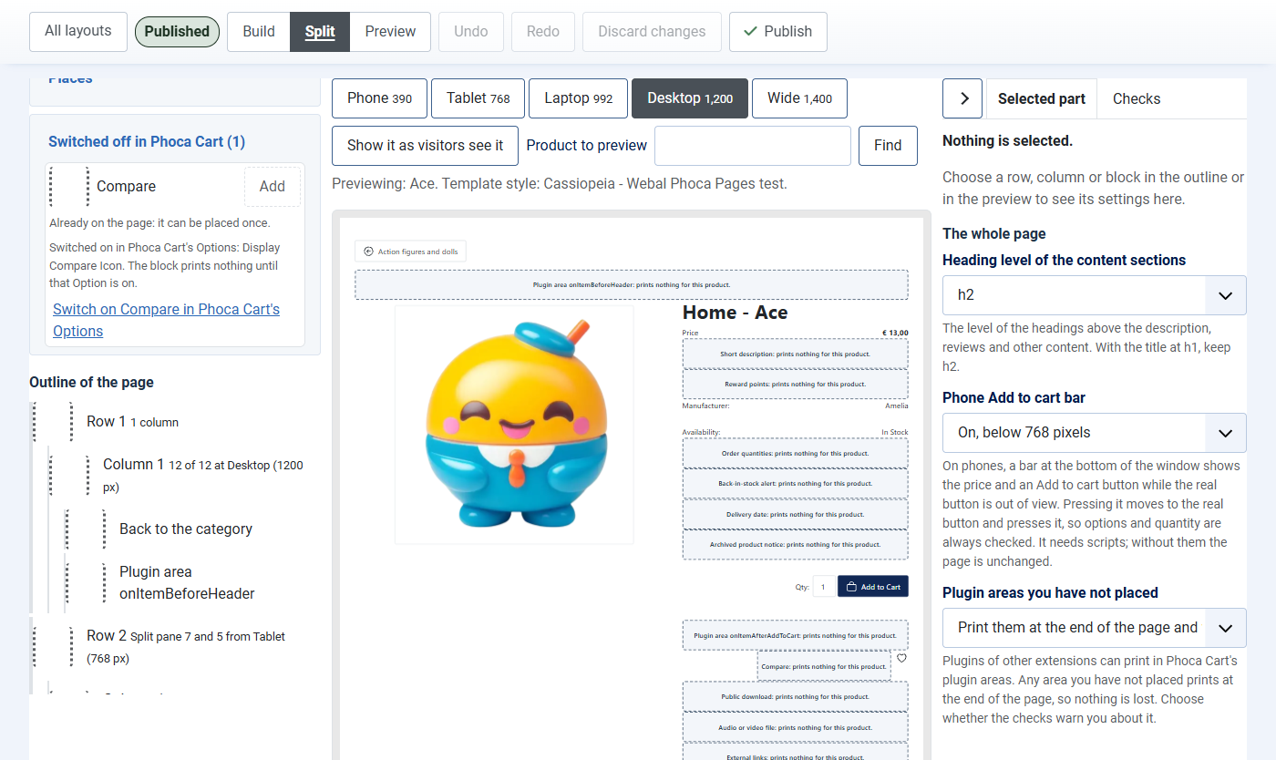
Other Phoca Cart plugins can print in plugin areas of the product page. Each plugin area is a block that prints nothing until a plugin uses it. Any plugin area you have not placed prints at the end of the page, so no plugin output is lost.
In The whole page, Plugin areas you have not placed chooses what the checks say about them:
- Print them at the end of the page and warn me (the default): the checks warn, so you can decide where they go;
- Print them at the end of the page: the checks only note it. Choose this when your shop uses no such plugins.
Switched off in Phoca Cart
Some parts of the product page can be switched off for the whole shop in Phoca Cart's Options, for example the wish list or the price history. Their blocks sit in the palette's last group, Switched off in Phoca Cart, named with that Option in Phoca Cart's own words. A placed block whose part is switched off prints nothing, and it is marked Off in Phoca Cart in the outline and in the checks.
If you may change Phoca Cart's Options, each block in that group has a link that opens them at the right tab. The builder saves your draft first. Close or "Save & Close" in Phoca Cart's Options brings you back.
Next: The gallery.